
Styleguide
Every colour, size and element the site is allowed to use. Sign off here before pages build on it.
Brand marks





Colour
- Background
--color-bg - Surface
--color-surface - Surface sunk
--color-surface-sunk - Ink
--color-ink - Ink muted
--color-ink-muted - Line
--color-line - Brand (logo blue)
--color-brand - Brand strong
--color-brand-strong - Brand tint
--color-brand-tint - Night
--color-night - Night raised
--color-night-raised - On night muted
--color-on-night-muted - Danger
--color-danger - Success
--color-success
Typography
--text-4xlWhere scrolls are revealed
--text-3xlWhere scrolls are revealed
--text-2xlWhere scrolls are revealed
--text-xlWhere scrolls are revealed
--text-lgLede / large body — The Sabartha preview is free to download.
--text-baseBody (17px, never below 16px) — The Sabartha preview is free to download.
--text-smSmall — The Sabartha preview is free to download.
--text-xsExtra small / labels — The Sabartha preview is free to download.
Spacing & radius
--space-1--space-2--space-3--space-4--space-5--space-6--space-7--space-8--space-9--space-10--radius-sm--radius-md--radius-lg--radius-pillButtons
Email signup — all states
Idle
One quick check
Our email provider needs to confirm you’re a person. Complete the check below and your preview is on its way.
Check your inbox
We’ve sent a confirmation email to your inbox. Tap the button inside and your preview is on its way.
Can’t see it? Check your spam or promotions folder, or email bethelohim@nazarenehebrews.org.
Free to download. No purchase required. Unsubscribe at any time.
Submitting
One quick check
Our email provider needs to confirm you’re a person. Complete the check below and your preview is on its way.
Check your inbox
We’ve sent a confirmation email to your inbox. Tap the button inside and your preview is on its way.
Can’t see it? Check your spam or promotions folder, or email bethelohim@nazarenehebrews.org.
Free to download. No purchase required. Unsubscribe at any time.
Error
One quick check
Our email provider needs to confirm you’re a person. Complete the check below and your preview is on its way.
Check your inbox
We’ve sent a confirmation email to your inbox. Tap the button inside and your preview is on its way.
Can’t see it? Check your spam or promotions folder, or email bethelohim@nazarenehebrews.org.
Free to download. No purchase required. Unsubscribe at any time.
Success
One quick check
Our email provider needs to confirm you’re a person. Complete the check below and your preview is on its way.
Check your inbox
We’ve sent a confirmation email to you@example.com. Tap the button inside and your preview is on its way.
Can’t see it? Check your spam or promotions folder, or email bethelohim@nazarenehebrews.org.
Free to download. No purchase required. Unsubscribe at any time.
Idle — on night
One quick check
Our email provider needs to confirm you’re a person. Complete the check below and your preview is on its way.
Check your inbox
We’ve sent a confirmation email to your inbox. Tap the button inside and your preview is on its way.
Can’t see it? Check your spam or promotions folder, or email bethelohim@nazarenehebrews.org.
Free to download. No purchase required. Unsubscribe at any time.
Not connected (what ships if the Kit form ID is missing)
One quick check
Our email provider needs to confirm you’re a person. Complete the check below and your preview is on its way.
Check your inbox
We’ve sent a confirmation email to your inbox. Tap the button inside and your preview is on its way.
Can’t see it? Check your spam or promotions folder, or email bethelohim@nazarenehebrews.org.
Free to download. No purchase required. Unsubscribe at any time.
Objects
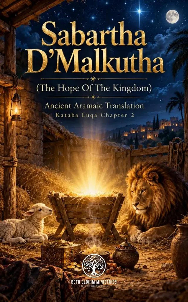
Card title
Cards use surface, a 1px line and the large radius.